


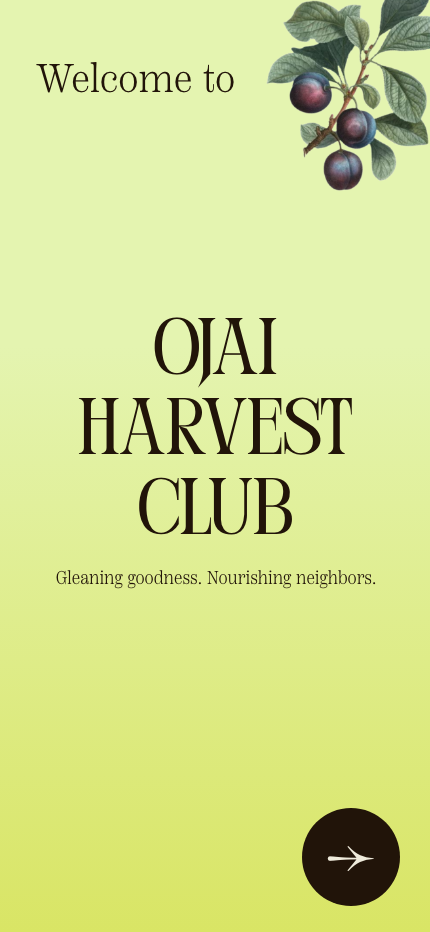
OJAI HARVEST CLUB
UX/UI Design + Brand Design

Ojai Harvest Club is a nonprofit in Ojai, CA, that harvests surplus produce from local spaces, including parks, homes, and farms, and helps distribute the healthy produce to neighbors in need. I created an app so folks can more easily plug into and engage with their work.
See full case study below.


PROJECT OVERVIEW
Ojai Harvest Club is a nonprofit in Ojai, CA, that harvests surplus produce from local spaces, including parks, homes, and farms, and helps distribute the healthy produce to neighbors in need. To make their work more accessible for their various user groups, I designed an app for the organization. Ideally, this app model could also be utilized by other orgs doing similar work in different locations.
-
Many people are interested in Ojai Harvest Club’s work, but aren’t sure how to connect. They have myriad potential user groups, including volunteers, folks with extra produce, organizations looking to partner, and neighbors looking for resources on free food in the community.
-
To design an app in which the various user groups can find the information they need, and complete any relevant processes
-
UX designer for the Ojai Harvest Club app and website, from conception to delivery
Creating paper and digital wireframes, developing low and high-fidelity prototypes, conducting usability studies, accounting for accessibility, and iterating on designs
RESEARCH
Summary
I created personas, user journey maps, conducted a competitive audit, and conducted a usability study to assess how to best serve the needs of our users.
The most prominent concern was a streamlined and clarified way to access information and complete all relevant processes in a simple flow.
•
Pain Points
-
Users lack a clear space to find out about upcoming events, as well as information about what volunteering entails.
-
Users from NGOs and faith-based entities do not have access to a streamlined partnership process, relying instead on time-consuming back-and-forth email correspondence.
-
Without a streamlined process to submit a harvest request, potential produce donors can become overwhelmed, dismayed, or reach a dead end.
-
This current obstacle is a major barrier in OHC’s ability to serve their community. Without the ability to find nearby food distributions, many folks who could benefit from the harvest hauls are left in the dark.
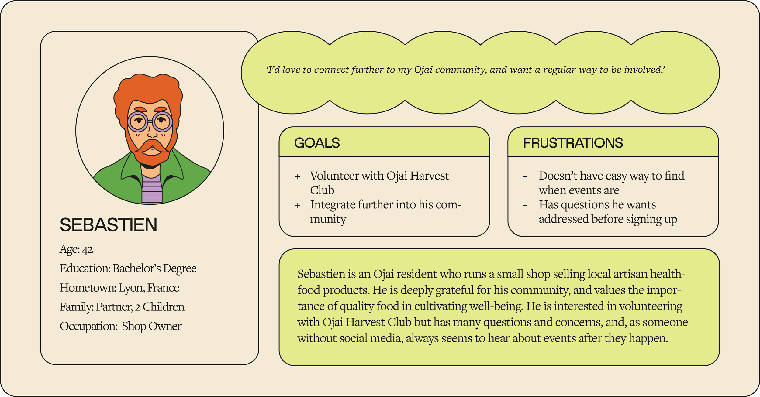
User Persona: Sebastien
‘As a local shop-owner who appreciates my community and healthy food access, I want to volunteer with an organization that aligns with my values, so that my neighbors can have access to nutritious food.’
User Journey: Sebastien
The user journey map for Sebastien revealed the importance of clear, prominently-placed prompts that allow him to fully understand and complete the volunteer sign-up process. It is vital to make initial sign-up steps as minimally demanding as possible, and to ensure that it is clear where users with different needs (volunteer, donate, partner, find food) ought to go.

☉ Problem Statement
Sebastien is an Ojai community member who cares about healthy food access, who wants to easily find info and sign up to volunteer with OHC, because he wants to support his community via an organization that aligns with his values.
&
☞ Hypothesis Statement
If Sebastien can easily find information on volunteering and complete event registration, he will be more likely to join OHC, and be able to cultivate an increased sense of community in alignment with his passions and values.
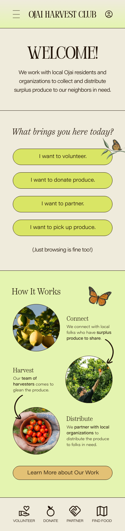
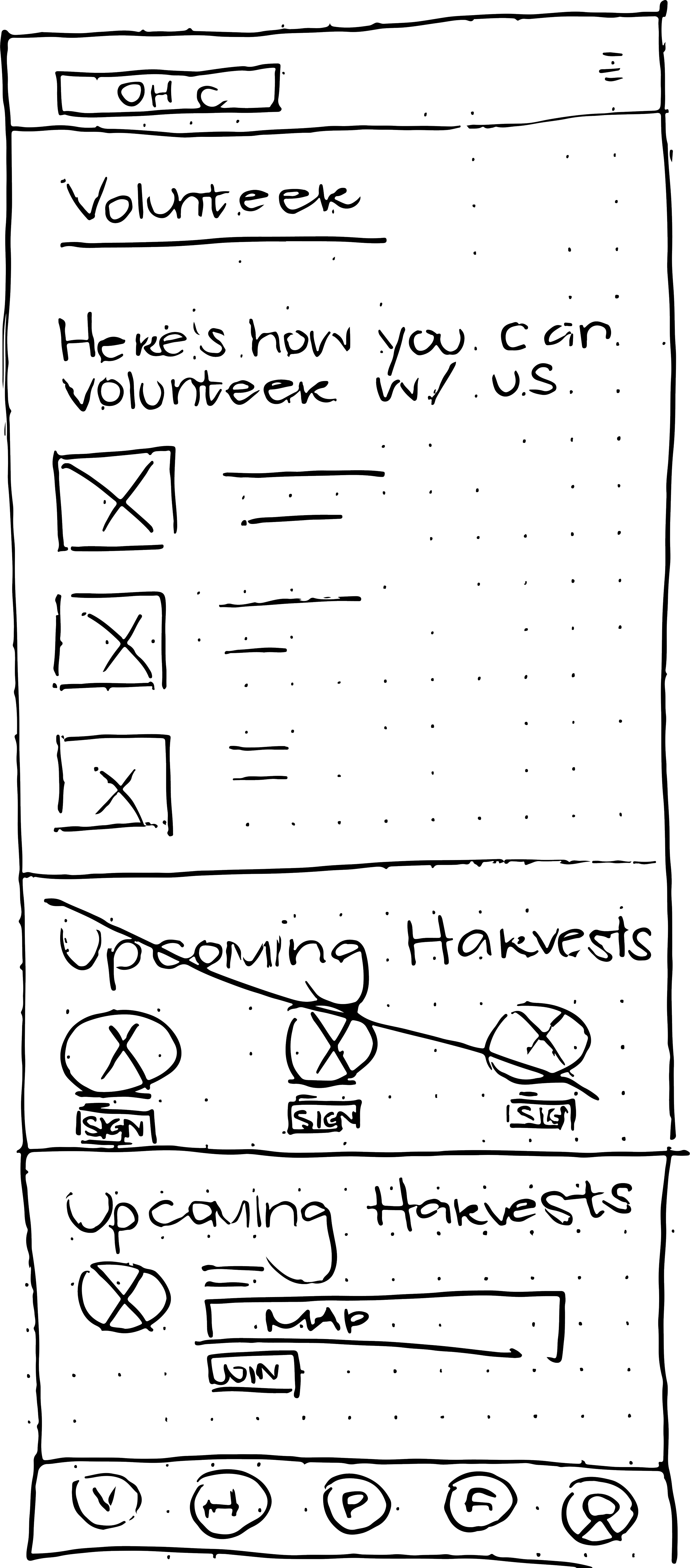
WIREFRAMES + MOCK-UPS
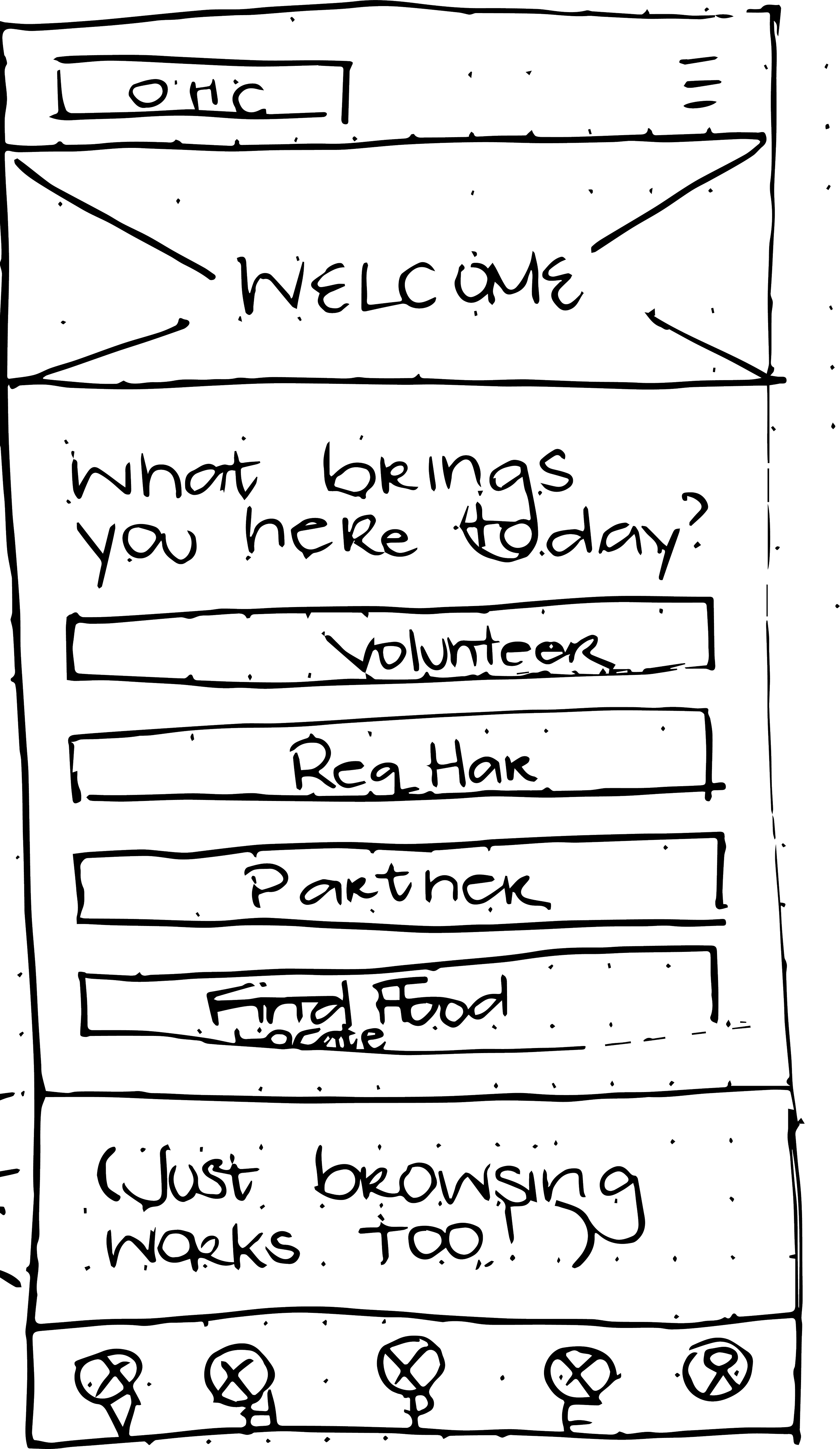
Paper Sketches


Digital Mock-Ups
↓
USABILITY STUDY
After testing an initial prototype, these were the clear features that required updates.

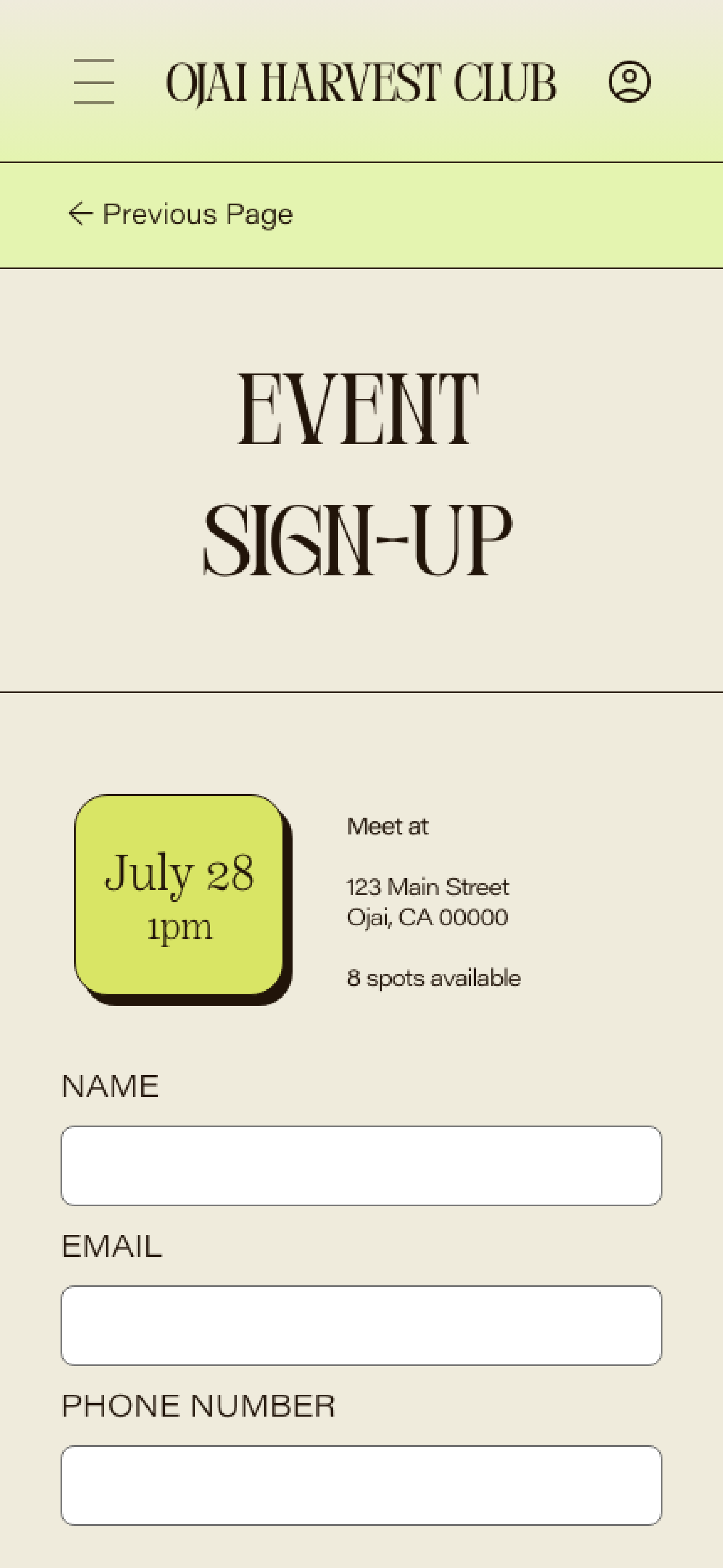
Lack of Back Button
The lack of ‘Back’ or ‘Previous Page’ made it difficult for users to backtrack if they made a mistake, rendering them stuck.
↓
Lack of Animation
The process between pages had no ease or animation, and made the app feel a bit underdeveloped.
↓


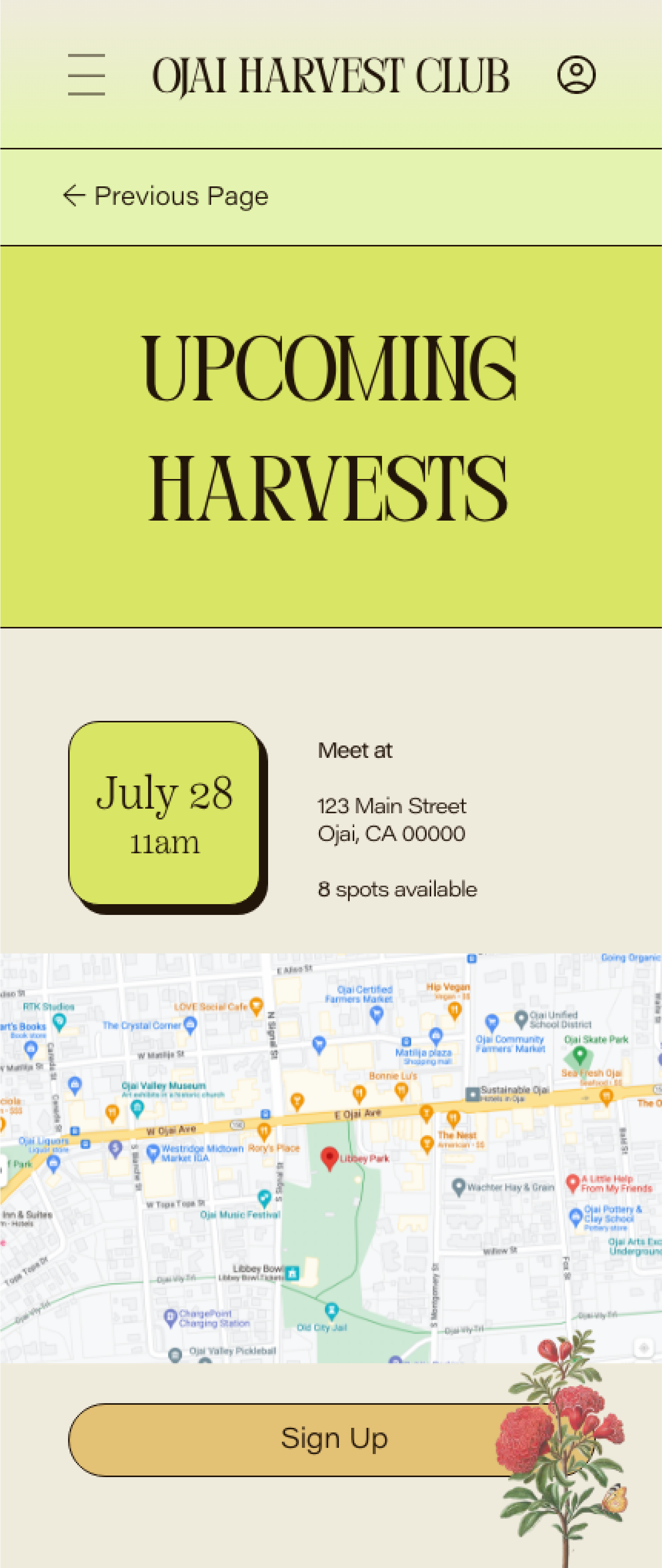
Location Aids
I added small maps under the event information so users could get a quick glimpse into whether the event would be convenient/accessible for them.
↓
The Updated
KEY MOCKUPS


↓
INTO A HIGH-FIDELITY PROTOTYPE
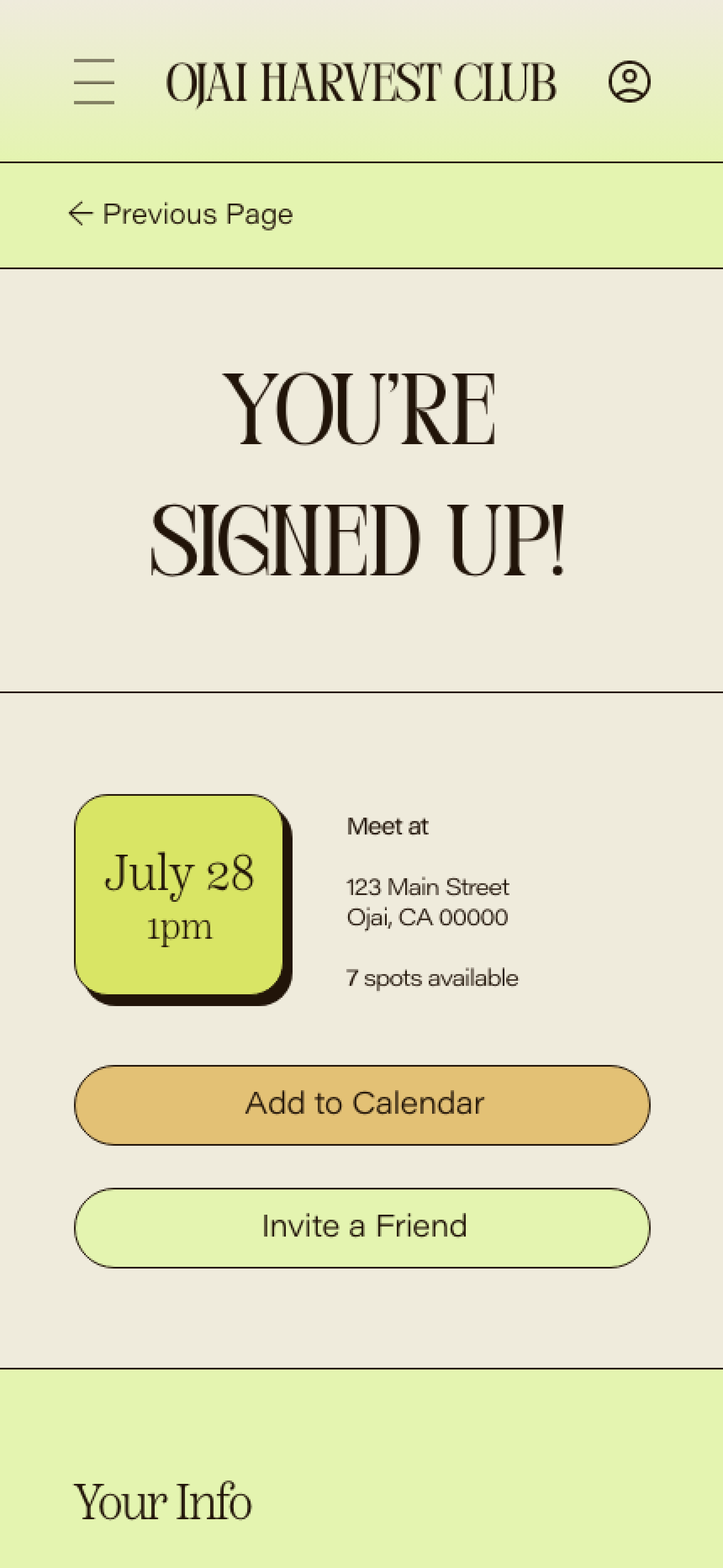
The new prototype afforded users a smoother experience, allowing them to navigate, specific to their unique needs, with greater ease.
Please note this prototype is for signing up for an event and does not have full functionality for other tasks.
View the updated prototype here.
ACCESSIBILITY CONSIDERATIONS
I integrated the following elements to account for accessibility needs. More tools and suggestions for increased accessibility are always welcome.
-
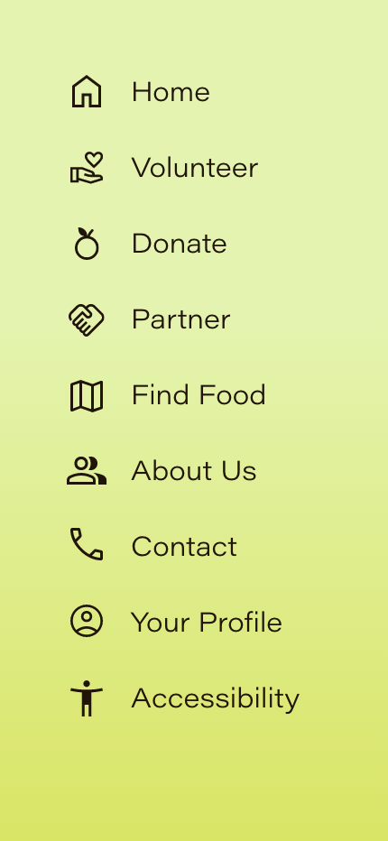
Icons were employed throughout the app to make navigation easier for those who have difficulty reading English
-
Color contrast ratios were checked to ensure adequate accessibility
-
We added a page for accessibility, accessible through the hamburgers menu, so users can find their specific accessibility needs easily
TAKEAWAYS
Impact
The product will allow users of various interests and wants to complete their desired tasks and interactions within the app. This accessibility will enable OHC to expand their impact, drawing in new users from across the spectrum that will help their organization flourish and better achieve its mission.
•
What I Learned
I learned that creating simple, streamlined processes for various user groups can empower people to more efficiently engage with organizations they admire. Breaking down barriers to accessing organizations doing such meaningful work is invaluable, both for the organization itself, the people they serve, and the community at large.
SUGGESTIONS FOR NEXT STEPS
Research
Conduct another round of usability studies to ensure users from other potential groups, and with various accessibility needs, can easily use the app.
+
SEO Optimization
I would suggest investing in SEO optimization to ensure that the new app can be found readily by anyone looking for information on OHC.